There's no denying the charm of 18th- and 19th-century architecture, especially in those East Coast cities where contemporary apartments come at a premium price point. Fixer-uppers can often be had for a steal, and there's something romantic about pouring time and money into a space to make it all your own.
Yet updating an older home presents a unique design challenge: It can't be too trendy if you're planning to sell, but it shouldn't feel like a museum.
So how can you strike the right balance? We turned to Lexi Tallisman, a New York City designer with Grayscale Interiors, to see how she transformed a dated pre-war apartment into a contemporary home that lets its lofty architecture shine.
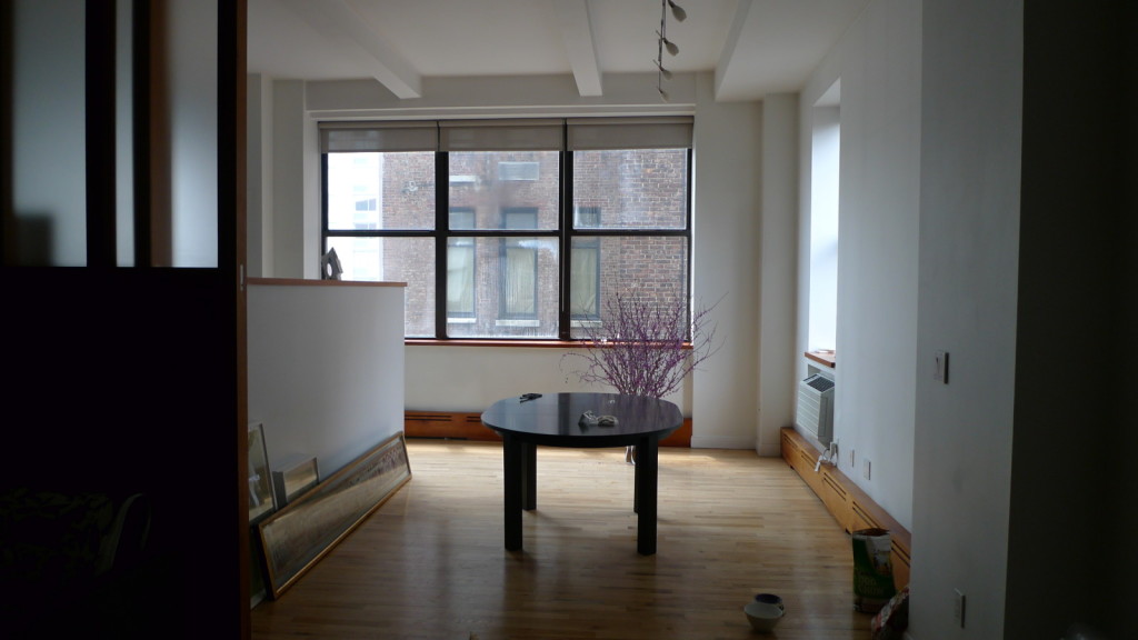
Living room
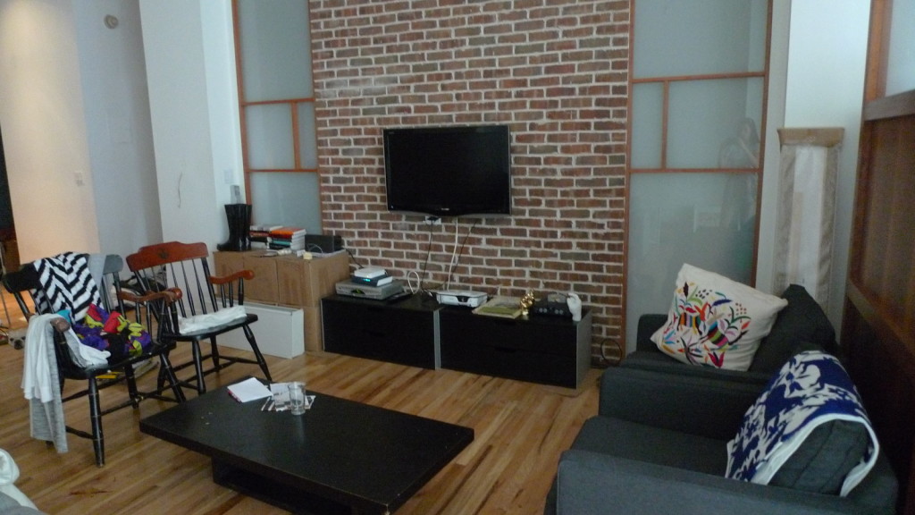
The loft-like apartment didn't feel dated because of its 1911 architecture, but thanks to the previous tenants' additions. On either side of an exposed brick wall stood a shohi screen - perhaps to give the illusion of continuity, since the bedroom had the same feature.
The space did indeed have a Japanese feel, but Tallisman says the screens felt like an afterthought, and ended up dominating the room. "The frosty glass panels seemed very early ’90s, and didn't feel classic," she says, adding that they weren't refined enough to work in the space.
Living room before.
Another problem was the exposed brick wall, which, combined with the screens, made the room feel too cluttered. "Typically, brick walls are a no-no to cover up. However, the owner was adamant about making the apartment look modern," Tallisman says.
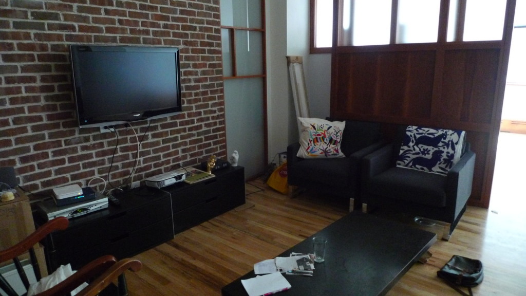
After sheetrocking over the brick, Tallisman painted the rest of the space bright white. Suddenly the space felt more open - and hip. The shohi screen enclosing the bedroom found its edge, and the hardwood floors emerged from the shadows.
Living room before.
Early on, Tallisman had decided to "work with the wood that was there," she says of the honey-colored shohi screen and molding. "If we had removed it, it would have had a totally different effect," she notes - not to mention taking away from the charm of the layout.
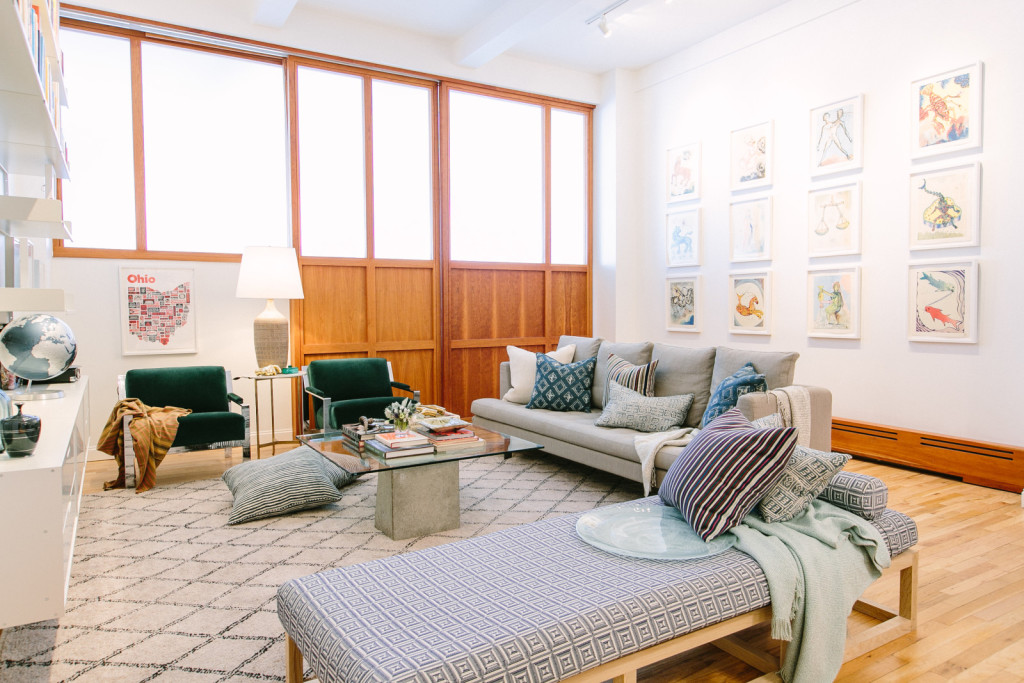
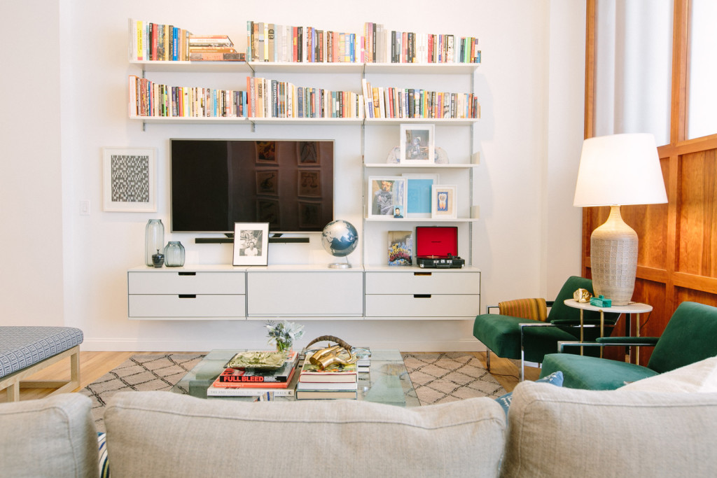
To keep the focus on the architecture, Tallisman chose "cleaner pieces of furniture" to outfit the space. A pair of cozy vintage chairs were upholstered in emerald velvet - "It's not too mossy or a shocking green, and it just worked tonally with the wood," the designer says - while a low-profile sofa was chosen to play up the "New York loft feel."
Living room after.
For visual interest, Tallisman found a sculptural coffee table with two cement block supports and a glass top. A goes-with-everything Beni Ourain rug "warmed up the space."
Tallisman kept the simple track lights that had previously been installed. "We weren't trying to play with too many things hanging from the ceiling," she says. "It's a high ceiling, which is enough of a statement."
Living room after.
Bedroom
Enclosed by the Japanese screen and a low wall dividing the dining area, the bedroom felt like a forgotten corner. "The bed looks thrown there, which it probably was," says Tallisman. "It was literally a mattress on the floor shoved against the side wall." The Japanese-style shelves were another remnant from previous tenants, and encouraged more clutter.
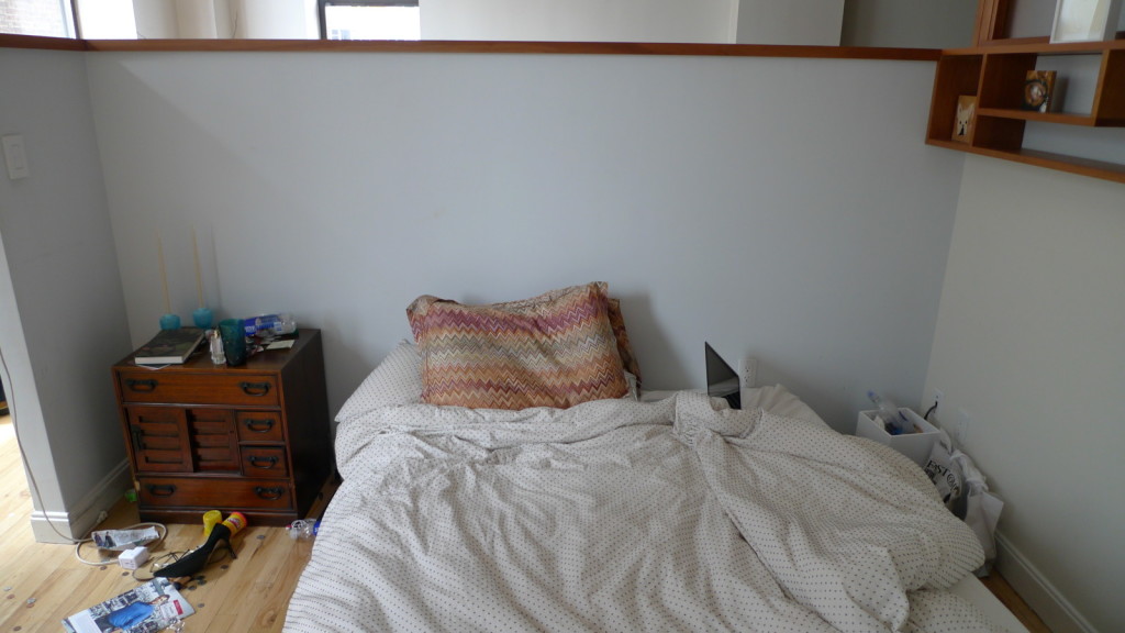
Bedroom before.
"Defining that space was key, and wrapping the wallpaper all around made it feel like a room," Tallisman says. Fornasetti wallpaper from Cole & Son, in Britain, added Old World elegance and custom ultra-contemporary sconces provided a fresh contrast.
"Even though the paper's dramatic, it's not so harsh on the eye," says Tallisman. "It perfectly blends in, and gives a good defining point to the space."
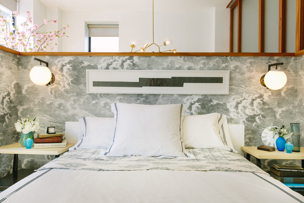
Bedroom after.
Dining Room
In the dining area, the track lights were unremarkable, the dark table overpowered the wood, and the overall feeling was gloomy.
Dining room before.
To brighten things up, "we first chose the kitchen lights, which are these hovering white lacquered pieces we found at a cabinetry store," Tallisman says. "It reminds me of works by lamp designer Michael Anastassiades."
To bring in a feeling of nature, the designer had a huge slab of green onyx cut into a "racetrack ellipse" instead of a complete oval for the dining table. "We didn't want it to be harsh and square," she explains.
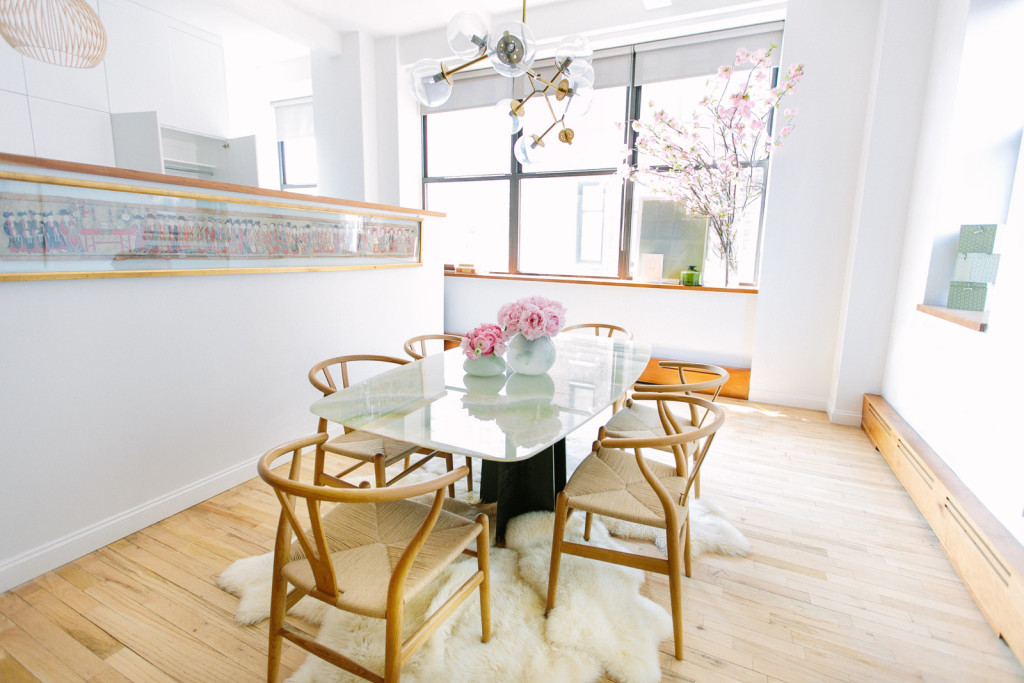
Dining room after.
The wishbone chairs perfectly suited the wooden accents. "A space doesn't need to have so much going on to speak volumes," Tallisman says. "Layering textures has so much more of an impact."
Bathroom
Dueling tile patterns, a lack of storage and creamy beige paint made the bathroom look dull. Even the granite floors felt like a distraction.
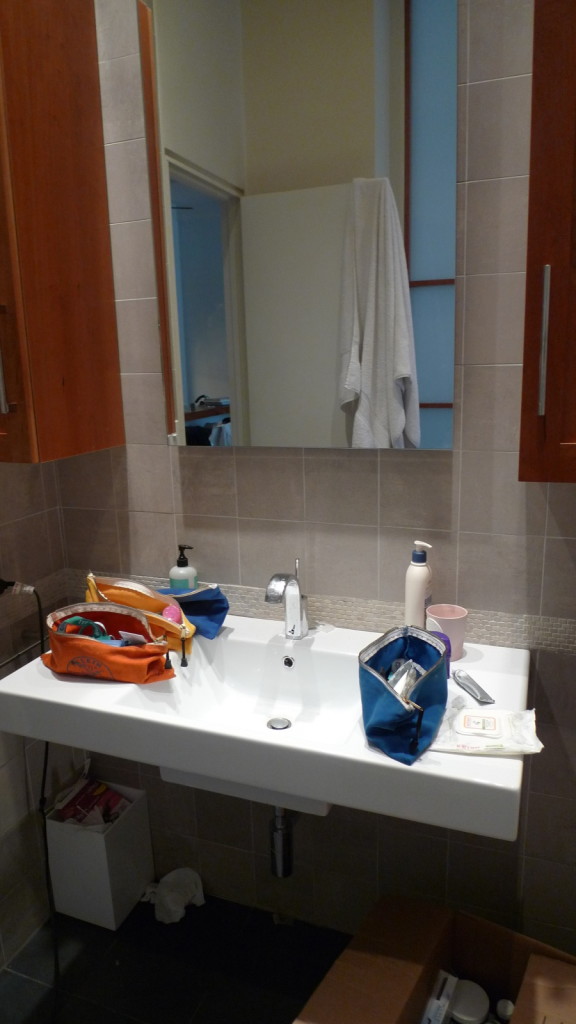
Bathroom before.
To play up the room's high ceiling, Tallisman painted it a deep green "to draw your eye up." Then she painted the rest of the walls stark white, and had a contractor build a cabinet beneath the existing sink because "you can never have too much storage in New York City," she says.
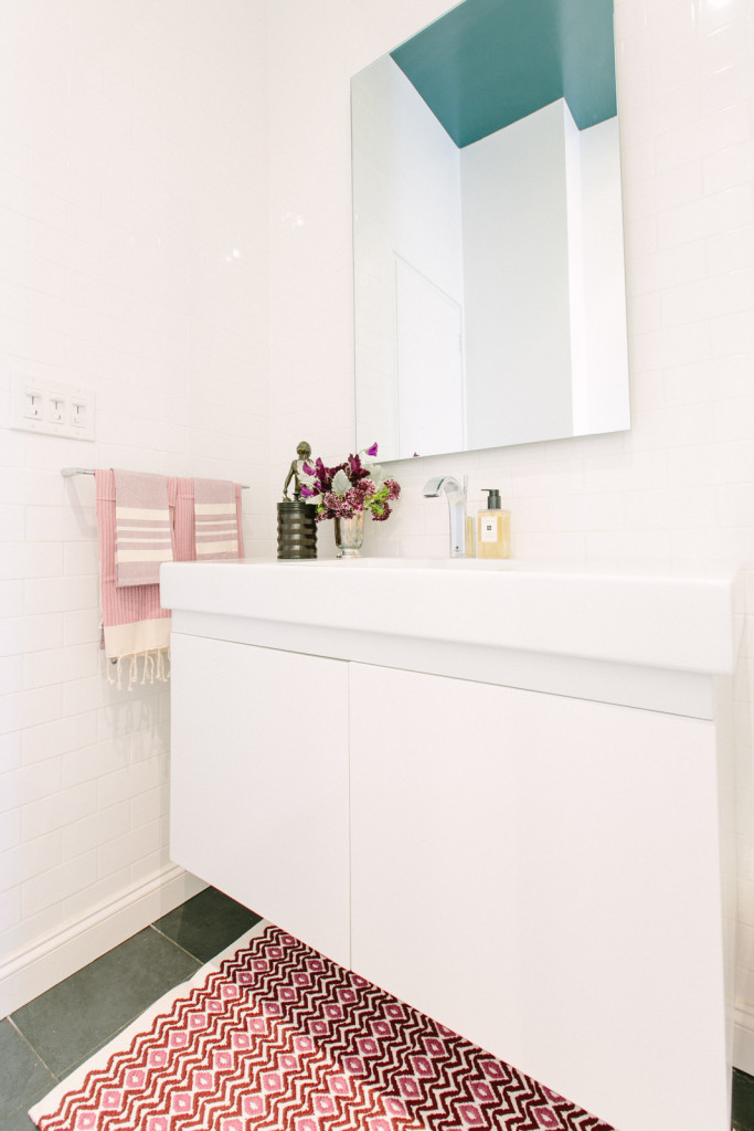
Bathroom after.
Tallisman also added of-the-moment subway tile to the shower, which "made it feel like a whole new space."
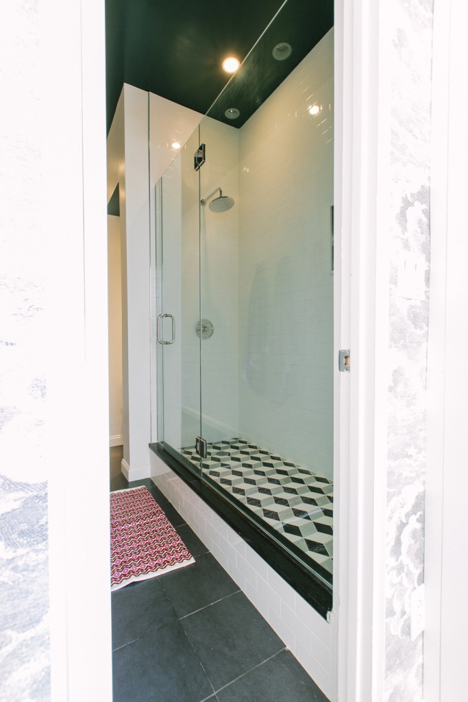
Bathroom after.
As with the rest of the apartment, the light palette with pops of pink and green doesn't feel overdone, and adds an element of surprise. "What makes it fresh is the stark white," and, of course, allowing the best aspects of the old architecture to shine through.
Before images courtesy of Lexi Tallisman; after images courtesy of Tawni Bannister.
Related:
- Staying Put vs. Moving Out: The Remodeling Dilemma
- 3 Low-Key Color Palettes for a Sophisticated Home
- Before & After: 4 Millennials Rescue a Detroit Home From Decay
from Zillow Porchlight | Real Estate News, Advice and Inspiration http://www.zillow.com/blog/pre-war-apartment-remodel-194715/
via Reveeo
No comments:
Post a Comment