So you've fallen for a house that has great bones, but some off-putting 20-year-old design. Not to worry - giving a home a modern update isn't as hard as it sounds.
In fact, it can feel like playing detective, in which your mission is to spot the key culprits. To get you inspired, we tapped Tharon Anderson, a New York-based interior designer with residential projects in Boston and Westchester, to reveal how she worked some serious magic on a desperately dated home in Scarsdale, NY.
Powder room
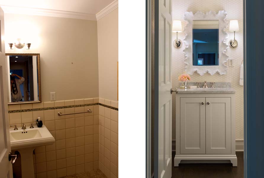
The original powder room (left) lacked storage, but the new design (right) features a vanity cabinet.
"There's really no reason to have tile on the wall in a powder room," Anderson says. "It's not like there's a lot of moisture there."
The color of the tile was also a problem. "It had a very creamy base that was sort of an off-white, which felt really dated," she says. The over-the-sink lighting and lack of storage made what should have felt like a welcoming space look more like a rental unit.
In the updated room, the bright white details of the textured wallpaper and funky mirror frame are like a breath of fresh air. And the cabinet space? Talk about functional.
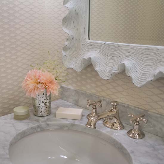
Textured wallpaper and an unusual mirror frame dress up the new powder room.
But perhaps the best part of the new look is the sconces. "We had space to the sides of the vanity, so putting the sconces there makes the room feel wider," Anderson says.
It's also more flattering. "Placing the fixtures above the mirror puts emphasis on the height of the room," throwing shadows on the face, she says. Placing them to the left and the right of the mirror makes it seem larger.
Swapping the old brass faucet for a shinier unit in copper didn't hurt, either.
Kitchen
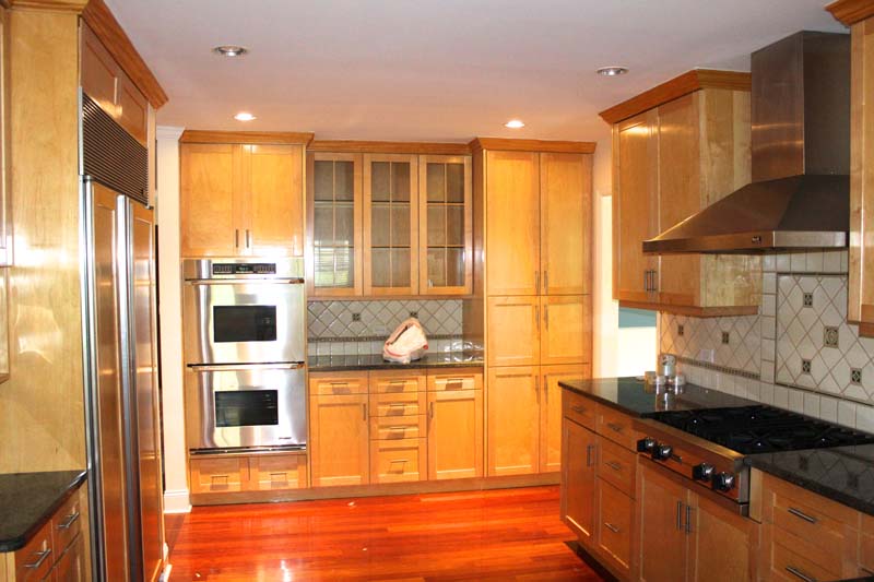
Although it had plenty of cabinet space and quality appliances, the original kitchen didn’t suit the new homeowners’ tastes.
"I generally tell people to spend money on their kitchens and bathrooms first," says Anderson, noting that these rooms tend to look the most dated because of appliances.
They're also where homeowners get the most resale value, so "having them updated is paramount." While the original kitchen might appeal to some, the 30-something couple wasn't in love with the light pine wood cabinets or homespun backsplash. The appliances, however, would stay put.
Since the bones of the kitchen, including the location of the appliances and plumbing, were fine, the challenge was to fix what was left. Anderson kept the existing countertops but replaced the existing backsplash with an inexpensive, bright-white subway tile that runs all the way up behind the hood.
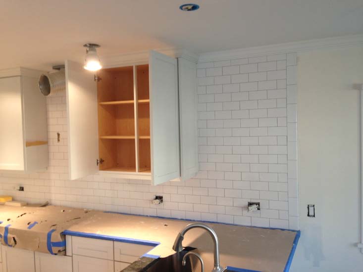
The renovation included replacing the dated backsplash with bright-white subway tile.
With exposed shelving currently in vogue, Anderson decided to knock out a few cabinets to make room for three shelves. "From a function standpoint, I'd recommend putting things on there that you use regularly, like plates and bowls," she advises. "Anything that sits there is just going to collect dust."
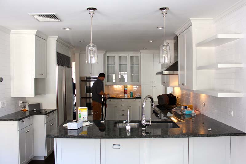
Replacing one set of cabinets with open shelving allows the homeowners to easily display and access favorite items.
Perhaps the most noticeable difference, however, is the addition of sleek pendant lamps above the counter. These can help anchor a space, act as decoration, and offer another layer of light, Anderson says. The third is especially useful in kitchens, where "you want overhead light for tasks, under-the-cabinet light so you can see counters clearly, and suspended lighting because it gives ambient light."
Children’s bathroom

A slew of updates gave the once-drab bathroom a fresh, modern look with whimsical details just right for a children’s space.
Another room, another case of bad tile. The couple disliked the dark wood, and Anderson wasn't sure what to make of the orange wallpaper accent.
Then there were the countertops: basic and brown. "We tried several options to stick with it, and it just wasn't worth it," the designer says.
Again, bright-white paint and thoughtfully placed sconces came to the rescue. "We added a double fixture and single ones on either side, which does a lot," Anderson says. "It's only one more bulb, but lowering the sconces" makes a world of difference.
On the ceiling, replacing the semi-flush mount light with a flush mount light with scalloped petals adds a touch of whimsy.
Then there are the little things, like choosing floor tile with just a hint of seafoam green to match the paint color on the wall, and adding a leopard-print-covered pelmet box to the window for more detail. It's a children's room, and this feels more fun.
Dining room
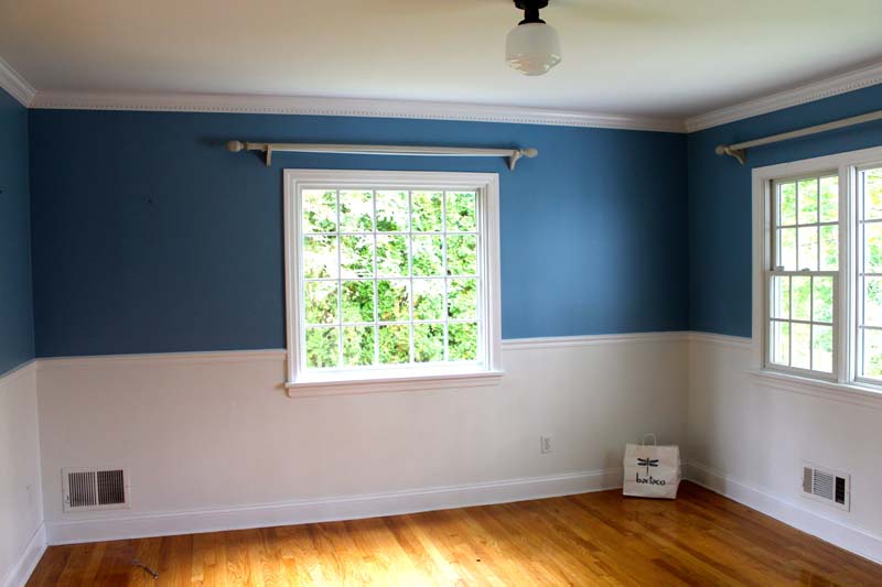
The dining room’s plain light fixture and flat paint job lacked drama.
"That's a weird light fixture to have in a dining room," Anderson says of the ceiling light. "It's not very special."
In addition, the blue paint was top-heavy and the honey-colored floor stain was very ’90s. Both had to go.
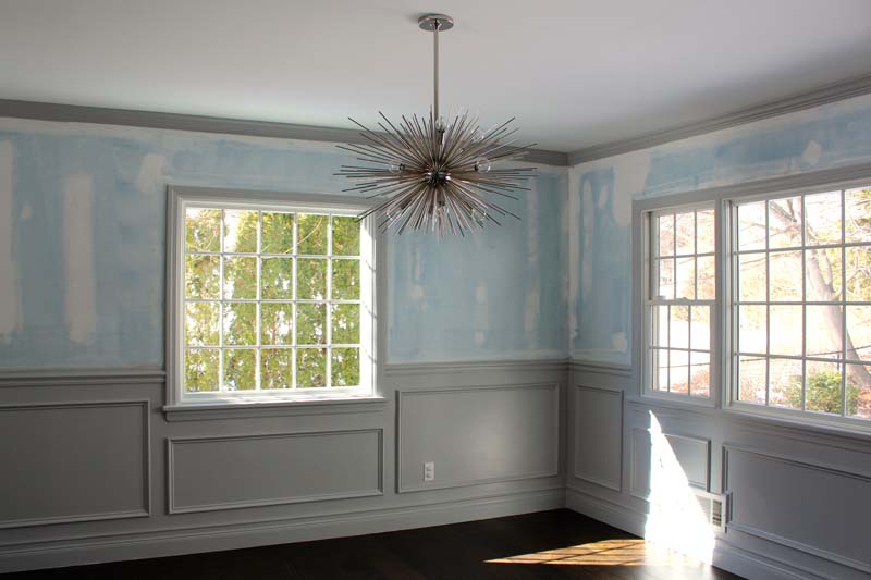
Dark-stained floors anchor the renovated dining room, while molding adds visual interest.
First, Anderson stained the floor a darker ebony color and installed a far more eye-catching light fixture to heighten the drama. Adding molding to the bottom half of the wall added another decorative element, while wallpaper - which is making a comeback - took it one step further. Again, bright-white paint freshened up the space.
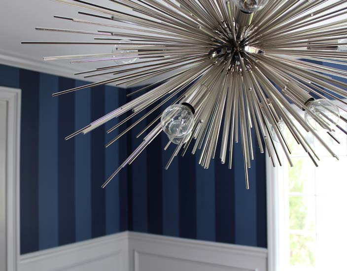
An on-trend ceiling fixture and bold wallpaper finish out the dining room makeover.
Master bedroom
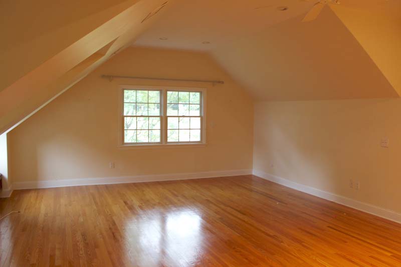
The generous space had potential, but it’s neutral look wasn’t doing it any favors.
From the warm, creamy beige walls to the awkwardly placed curtain rod, this room wasn't reaching its potential. And while the hardwood floors were nice, they weren't appropriate for a romantic retreat. The room needed to play up its interesting architecture and create a more serene atmosphere.
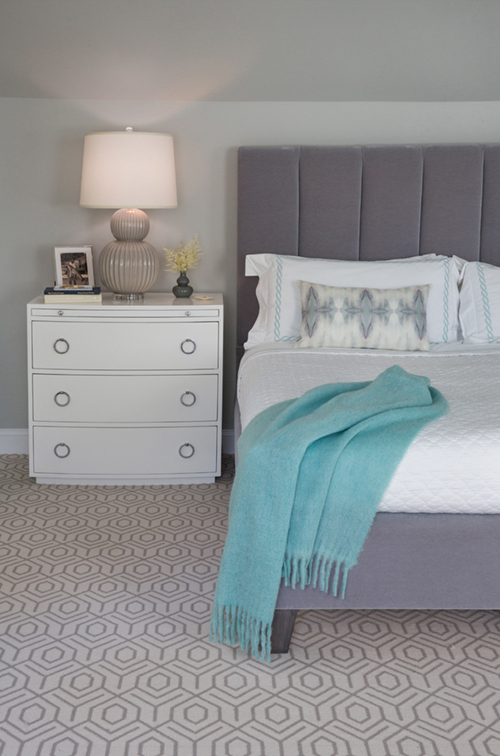
Soft colors and textures create a master bedroom suited to sweet dreams.
To start, Anderson ditched the warm hues, which give off a ’90s vibe. "Blue and seafoam are relaxing," she says, unlike "reds, pinks and purples, which are more stimulating."
The designer then painted the room a calming, cool blue and chose contrasting gray and white furniture. The addition of soft wool carpet made the space more luxurious.
Finally, raising the curtain rod "as high as we could" created the illusion of a much larger window - and a much higher ceiling.
Photos courtesy of Tharon Anderson.
Related:
- Before & After: Turning on the Lights in a Dated Kitchen
- Before & After: Dark Corner Kitchen Turned Bright Dining Nook
- One-of-a-Kind Design: Freshening Your Space
from Zillow Porchlight | Real Estate News, Advice and Inspiration http://www.zillow.com/blog/before-after-ditching-dated-design-191764/
via Reveeo
No comments:
Post a Comment