Taking cues from Pantone's Color of the Year 2016 announcement, the design world is starting to implement pastel colors into its palette.
While pastels might once have been reserved for nurseries and bridesmaid's dresses, they've grown up over the years and are taking a sophisticated turn, showing up in window coverings, upholstered fabrics, and even paint.
With Pantone's Rose Quartz and Serenity in mind, we've chosen a few of our favorite ways to bring pastels out of your toddler's space and into your living room, master bedroom, and bathroom.
Soft focus
When most people think of pastels, they tend to conjure up images of cotton candy pink and baby blue. But pastels are just lighter, creamier versions of hues we see every day.
In 2016, we see design shifting to classic comfort with soft, tufted sofas, large area rugs, and plenty of natural light. With this in mind, a sophisticated pastel pairing of blue and green helps make the room more serene and focused on calming color and texture, instead of the hard-lined modernity we're so used to seeing.
In this living room, the mantel has been painted a soft blue and is beautifully complemented by light and bright furnishings and a natural woven rug.
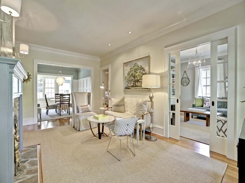
Courtesy of Zillow Digs.
On balance
Focusing on making the pastel color palette the center of the room, this bedroom is curated with fluffy textiles and simple features like window coverings, side tables, and framed mirrors.
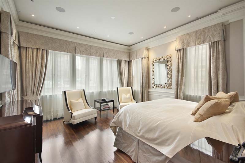
Courtesy of Zillow Digs.
The two armchairs, wrapped in creamy pastel upholstery, give the room a focal point. Complementing the lightly colored textiles and fabrics with dark wood accents lends a balanced look, rather than the overly feminine style most pastel color palettes seem to create.
Light and bright
In the bathroom, don't be afraid to make pastel paint the focal point. In fact, a coat of pastel blue paint can help brighten a bathroom that lacks natural light, like a guest or powder bathroom.
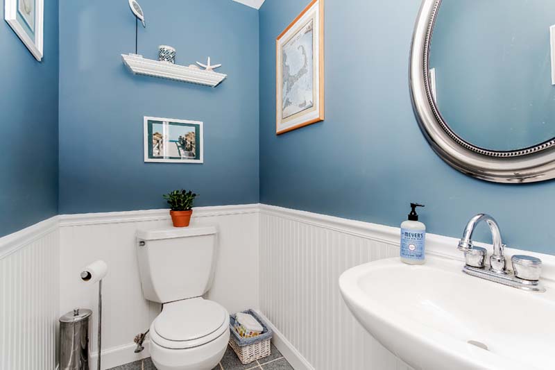
Courtesy of Zillow Digs.
Accessorize the pastel paint with nickel accessories. Because of its bright shininess, nickel accessories contribute clean and crisp design to the pastel coloring, balancing the tone and creating a fresh overall look. Sinks, vanities, showers, and tubs should also be bright and light.
Thanks to Pantone's pairing of pretty pastels for 2016, we can look forward to a whole new palette to work with. Don't be afraid to try pastels in your own home, from throw pillows and area rugs to paint and furniture.
Complement the colors with dark accessories and furnishings for a masculine tone, or light and bright pieces for a fun and feminine feel.
Related:
- Home Decor Challenge: The Big Blank Wall
- How to Create a Restful Bedroom
- One-of-a-Kind Design: Freshening Your Space for the New Year
from Zillow Porchlight | Real Estate News, Advice and Inspiration http://www.zillow.com/blog/decorating-with-new-pastels-190404/
via Reveeo
No comments:
Post a Comment